0932834179


Thông tin chi tiết dự án :LOGO – HECHA 现代茶
Tên dự án : HECHA 现代茶
Yêu cầu dự án : Tổng thể logo mang hơi hướng hiện đại, tinh gọn và cao cấp, phù hợp với mô hình
Phong cách thể hiện : Phong cách sống mới dành cho thế hệ trẻ hiện đại.
Ý tưởng triển khai :
Dự Án Thiết Kế Logo HECHA 现代茶 - Hiện Đại Trong Truyền Thống, Định Hình Phong Cách Trà Lifestyle Thế Hệ Mới
Trong thị trường F&B hiện đại, đặc biệt là ngành trà và đồ uống, logo không còn đơn thuần là dấu hiệu nhận diện thương hiệu. Một thiết kế logo hiệu quả cần thể hiện được phong cách sống, cảm xúc và tinh thần mà thương hiệu muốn truyền tải đến khách hàng.
Dự án thiết kế logo HECHA 现代茶 được Queen Brand triển khai với định hướng rõ ràng: xây dựng hình ảnh thương hiệu trà hiện đại, tinh tế và mang hơi thở lifestyle châu Á dành cho giới trẻ và dân văn phòng.
HECHA không lựa chọn lối thiết kế quá truyền thống hay quá dễ thương như nhiều thương hiệu trà hiện nay. Thay vào đó, thương hiệu hướng đến sự tối giản, nghệ thuật và có chiều sâu cảm xúc nơi trà không chỉ là thức uống mà còn là trải nghiệm thư giãn, kết nối và cân bằng trong cuộc sống hiện đại.
I. Định Hướng Thiết Kế Logo HECHA 现代茶
Tên thương hiệu “HECHA” kết hợp cùng cụm chữ Trung Quốc “现代茶” mang ý nghĩa “Trà hiện đại”. Đây cũng chính là tinh thần cốt lõi mà thương hiệu theo đuổi: giữ lại giá trị truyền thống của văn hóa trà Á Đông nhưng được thể hiện bằng tư duy thẩm mỹ mới mẻ, phù hợp với thế hệ trẻ.
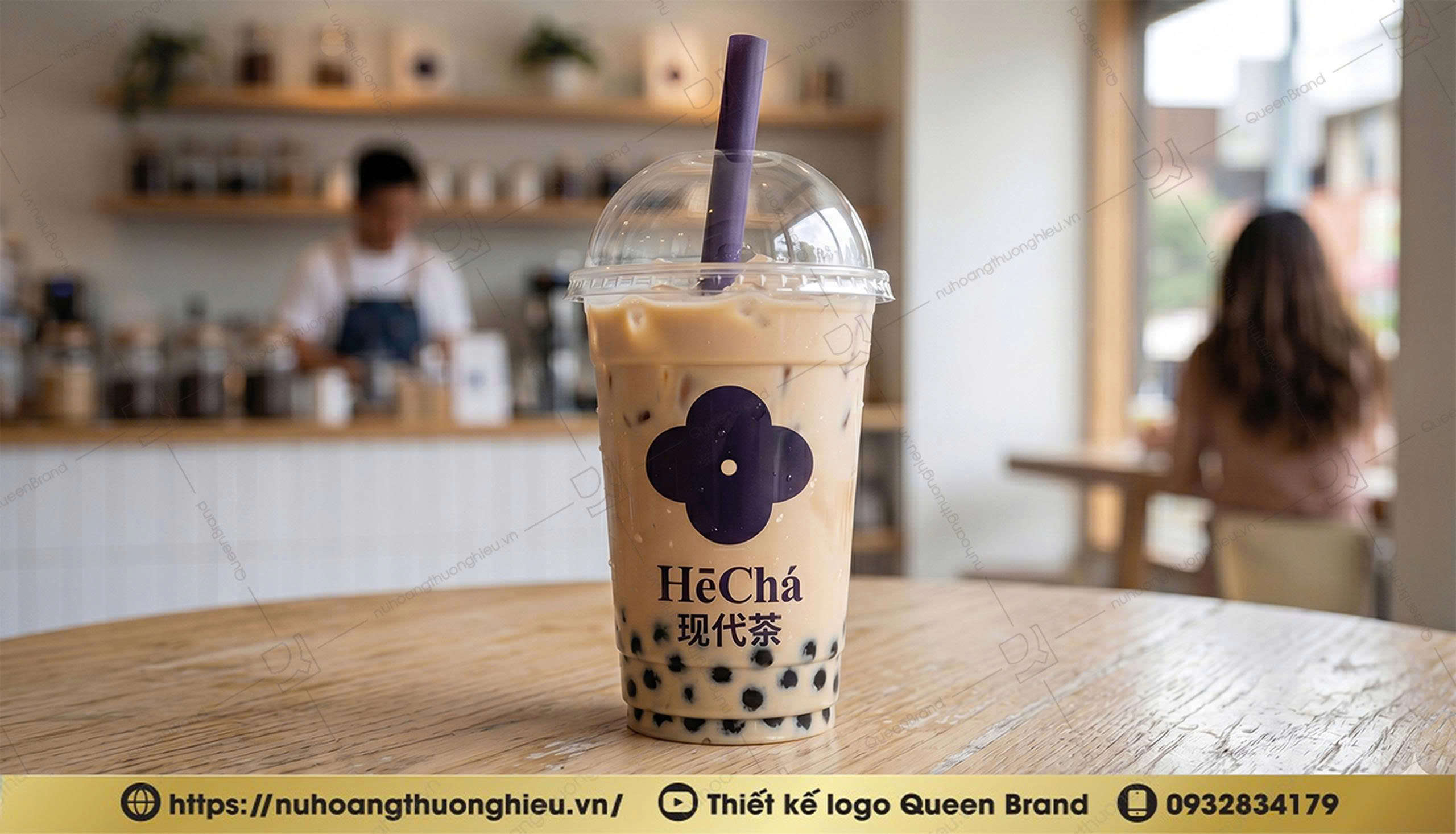
Trong bối cảnh thị trường trà ngày càng cạnh tranh, nơi hàng loạt thương hiệu xuất hiện với hình ảnh tương đồng, việc sở hữu một thiết kế logo có cá tính riêng là yếu tố quan trọng để tạo khác biệt.
Yêu cầu đặt ra cho dự án gồm:
- Thể hiện tinh thần “hiện đại trong truyền thống”
- Thiết kế tối giản nhưng có chiều sâu nghệ thuật
- Mang cảm giác cao cấp, thư giãn và tinh tế
- Phù hợp mô hình tea house phong cách lifestyle
- Dễ ứng dụng trên bao bì, bảng hiệu và không gian thương hiệu
Từ những định hướng đó, Queen Brand xây dựng giải pháp thiết kế logo theo hướng tối giản hình học, tập trung vào cảm xúc thị giác và khả năng ghi nhớ thương hiệu.
II. Ý Tưởng Thiết Kế Logo HECHA
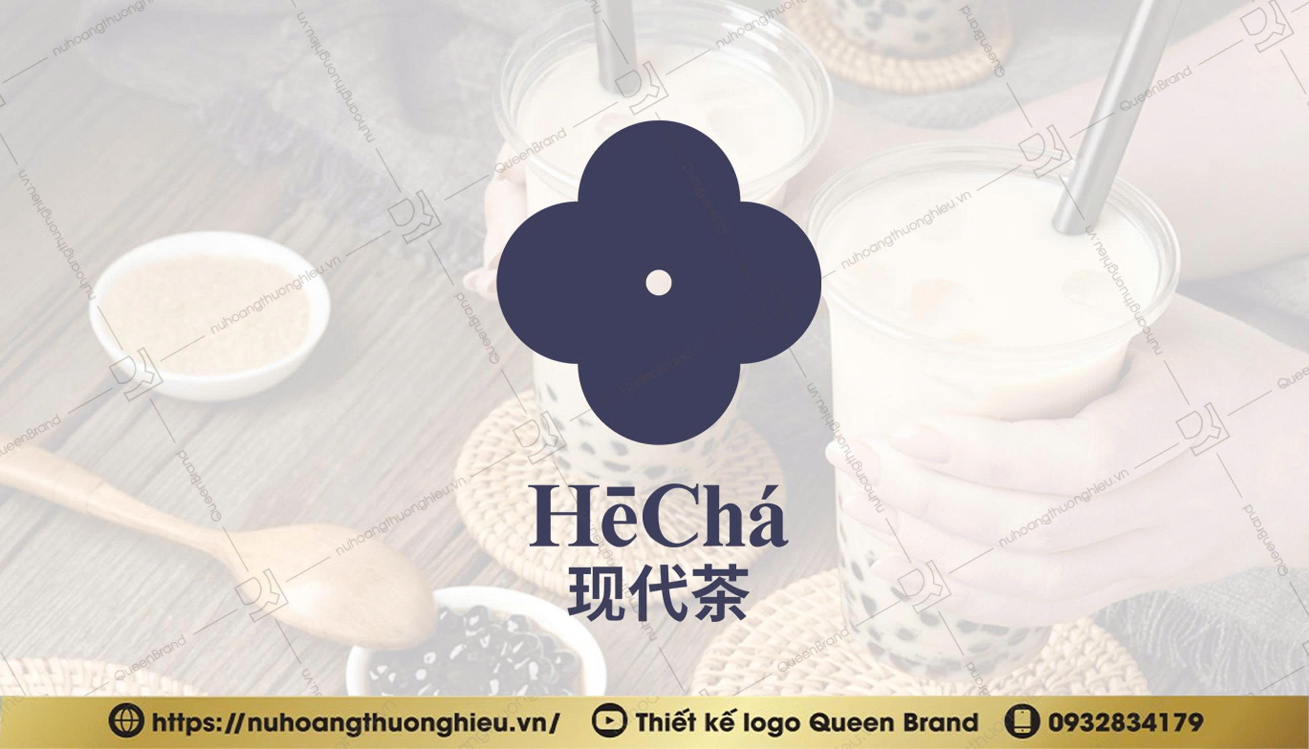
Biểu tượng logo HECHA được phát triển từ hình khối gồm 4 cánh bo tròn đối xứng, tạo nên tổng thể cân bằng và hài hòa.
Hình ảnh này gợi liên tưởng đến:
- Cánh hoa trà đang nở
- Biểu tượng của sự kết nối
- Trạng thái cân bằng trong cảm xúc và năng lượng
- Sự chuyển động mềm mại nhưng ổn định
Thiết kế đối xứng giúp logo mang lại cảm giác thư thái và cân bằng đúng với tinh thần thưởng trà hiện đại.
Điểm nhấn trung tâm là dấu chấm nhỏ nằm giữa biểu tượng. Đây là chi tiết mang tính biểu tượng cao trong toàn bộ hệ thống nhận diện của HECHA.
Dấu chấm đại diện cho:
- “Tâm điểm trải nghiệm”
- Nơi mọi cảm xúc hội tụ
- Sự tập trung và kết nối
- Khoảnh khắc thư giãn trong nhịp sống hiện đại
Thông qua chi tiết này, logo không chỉ mang tính thẩm mỹ mà còn tạo nên chiều sâu ý nghĩa cho thương hiệu.
Tổng thể logo được tối giản tối đa nhưng vẫn đảm bảo tính nhận diện mạnh mẽ, phù hợp với xu hướng thiết kế thương hiệu hiện đại hiện nay.
III. Thiết Kế Logo Trà Theo Phong Cách Lifestyle Hiện Đại
Một trong những yếu tố quan trọng của dự án HECHA là định vị thương hiệu theo phong cách lifestyle tea house.
Điều này đồng nghĩa logo không chỉ cần đẹp mà còn phải thể hiện được phong cách sống mà thương hiệu hướng đến.
Khác với các thương hiệu trà truyền thống thường sử dụng nhiều chi tiết Á Đông cổ điển, HECHA chọn hướng tiếp cận hiện đại hơn:
- Đường nét tinh gọn
- Hình khối rõ ràng
- Khoảng trắng thoáng
- Cảm giác premium và nghệ thuật
Phong cách này giúp thương hiệu dễ dàng tiếp cận:
- Giới trẻ hiện đại
- Dân văn phòng
- Khách hàng yêu thích không gian thư giãn
- Người quan tâm đến trải nghiệm và thẩm mỹ
Logo vì thế không chỉ phục vụ nhận diện, mà còn trở thành một phần của trải nghiệm thương hiệu trong không gian tea house, menu, bao bì và truyền thông.
IV. Ý Nghĩa Màu Sắc Trong Thiết Kế Logo HECHA
HECHA lựa chọn tông tím xanh làm màu nhận diện chủ đạo một lựa chọn khác biệt so với phần lớn thương hiệu trà trên thị trường.
Màu tím xanh mang nhiều tầng ý nghĩa:
Tính Hiện Đại & Sáng Tạo
Gam màu này thể hiện tinh thần trẻ trung, mới mẻ và có gu thẩm mỹ riêng. Đây là màu sắc giúp HECHA nổi bật giữa thị trường trà vốn quen thuộc với các gam xanh lá hoặc đỏ truyền thống.
Cảm Giác Cao Cấp
Tím trầm mang lại cảm giác premium, thanh lịch và có chiều sâu. Điều này phù hợp với định hướng thương hiệu theo phong cách tea house cao cấp.
Sự Bình Yên & Thư Giãn
Gam màu tím xanh còn gợi cảm giác nhẹ nhàng, thư thái và cân bằng cảm xúc đúng với tinh thần thưởng trà mà thương hiệu muốn xây dựng.
Màu sắc trong logo HECHA không chỉ tạo nhận diện thị giác, mà còn góp phần xây dựng cảm xúc thương hiệu ngay từ ánh nhìn đầu tiên.
V. Typography & Tinh Thần Thẩm Mỹ Châu Á Hiện Đại
Font chữ trong logo HECHA được lựa chọn theo hướng mềm mại, thanh lịch nhưng vẫn có độ nhận diện rõ ràng.
Sự kết hợp giữa chữ Latin “HēChá” và cụm chữ Trung Quốc “现代茶” giúp thương hiệu giữ được tinh thần Á Đông nhưng không bị cũ kỹ hay nặng tính truyền thống.
Đây là hướng thiết kế thường thấy trong các thương hiệu lifestyle châu Á hiện đại:
- Tối giản
- Nghệ thuật
- Có chiều sâu văn hóa
- Mang tính quốc tế
Typography được xử lý tinh gọn giúp logo dễ dàng ứng dụng trên nhiều nền tảng mà vẫn giữ được sự sang trọng và cân đối.
VI. Tính Ứng Dụng Của Thiết Kế Logo HECHA
Một thiết kế logo tốt không chỉ đẹp trên bản vẽ mà còn phải hiệu quả trong thực tế.
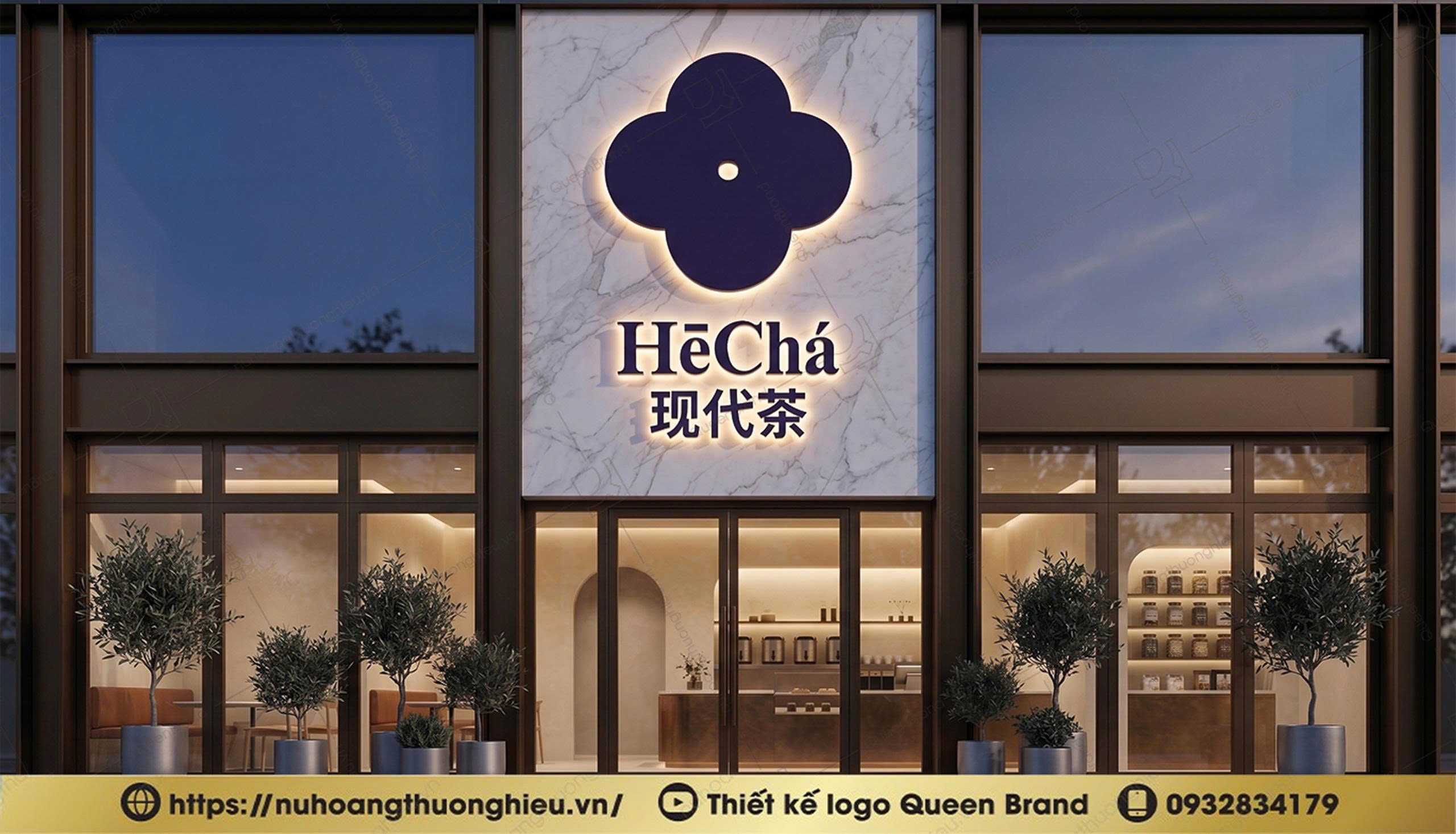
Với cấu trúc tối giản và hình khối rõ ràng, logo HECHA có khả năng ứng dụng linh hoạt trên nhiều chất liệu và nền tảng như:
- Bao bì ly trà
- Túi giấy
- Menu
- Biển hiệu
- Đồng phục
- Website
- Social media
- Không gian tea house
Thiết kế tối giản giúp logo luôn giữ được tính nhận diện ngay cả khi thu nhỏ hoặc in đơn sắc.
Đây cũng là xu hướng thiết kế thương hiệu hiện đại được nhiều thương hiệu quốc tế áp dụng để đảm bảo tính đồng bộ và bền vững lâu dài.
Tổng Kết Dự Án Thiết Kế Logo HECHA 现代茶
Dự án thiết kế logo HECHA 现代茶 là sự kết hợp giữa tư duy thương hiệu hiện đại và tinh thần văn hóa trà Á Đông.
Từ biểu tượng cánh hoa cân bằng, dấu chấm trung tâm giàu tính biểu tượng đến gam màu tím xanh mang cảm giác premium và thư giãn, toàn bộ logo được xây dựng nhằm tạo nên một thương hiệu trà có chất riêng, tinh tế và dễ ghi nhớ.
HECHA không lựa chọn hình ảnh quá truyền thống hay chạy theo xu hướng đại trà, mà hướng đến một bản sắc lifestyle hiện đại kiểu châu Á nơi trà trở thành trải nghiệm sống dành cho thế hệ trẻ.
Thông qua dự án này, Queen Brand tiếp tục khẳng định năng lực trong lĩnh vực thiết kế logo thương hiệu F&B, mang đến những giải pháp không chỉ đẹp về hình thức mà còn có chiều sâu chiến lược và giá trị ứng dụng thực tế lâu dài.
__________________________________________________________
HECHA 现代茶 Logo Design Project - Modern Within Tradition, Shaping a New-Generation Tea Lifestyle Brand
In today’s modern F&B market especially within the tea and beverage industry a logo is no longer simply a visual identifier. An effective logo design must express the lifestyle, emotion, and spirit that a brand wants to communicate to its audience.
The HECHA 现代茶 logo design project was developed by Queen Brand with a clear direction: to build a modern, refined tea brand infused with contemporary Asian lifestyle aesthetics for young professionals and modern consumers.
Rather than following overly traditional or overly playful tea-brand design trends, HECHA embraces a more minimalist, artistic, and emotionally driven identity where tea is not just a beverage, but an experience of relaxation, connection, and balance within modern life.
I. The Design Direction Behind the HECHA 现代茶 Logo
The brand name “HECHA,” combined with the Chinese phrase “现代茶” meaning “Modern Tea,” reflects the core philosophy of the brand: preserving the essence of traditional Asian tea culture while expressing it through a fresh and contemporary aesthetic aligned with younger generations.
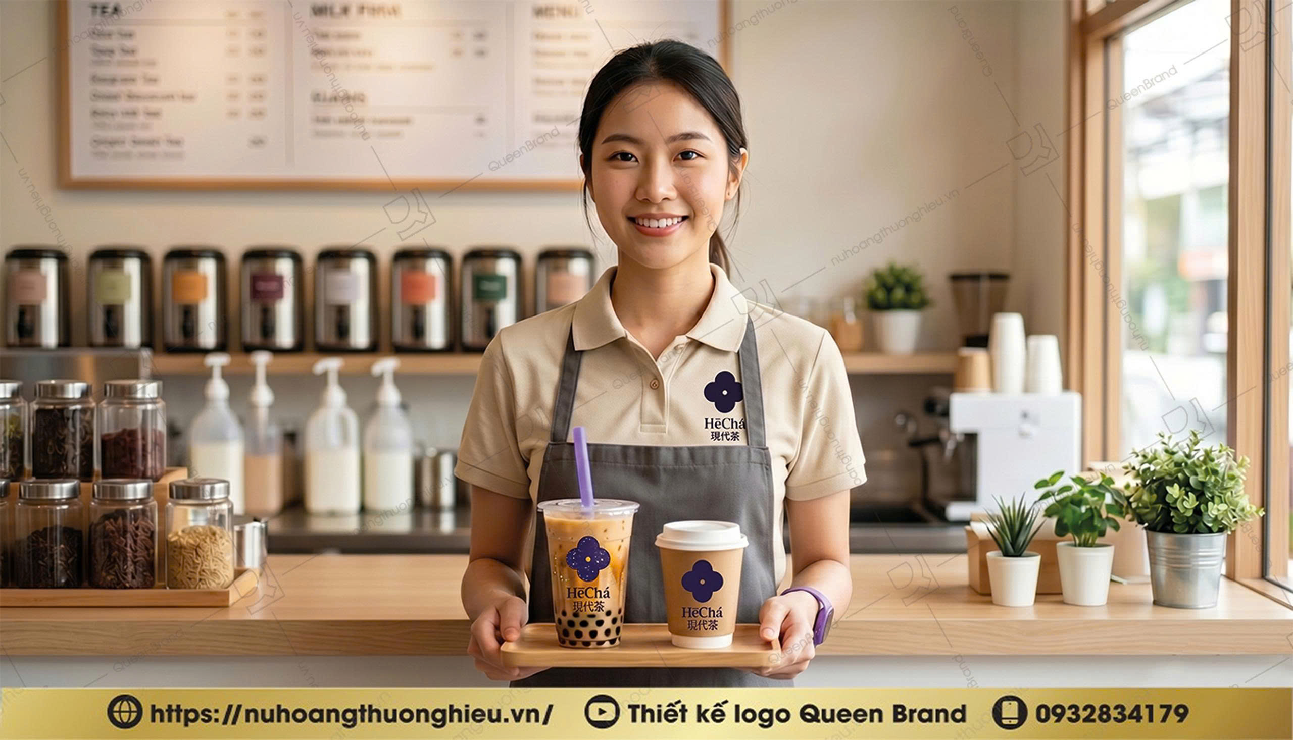
In an increasingly competitive tea market where many brands share similar visual identities having a logo with a distinctive personality becomes essential for standing out.
The key design objectives for this project included:
• Expressing the idea of “modernity within tradition”
• Creating a minimalist design with artistic depth
• Delivering a premium, calming, and refined feeling
• Supporting a lifestyle tea house positioning
• Ensuring flexibility across packaging, signage, and branded environments
Based on these goals, Queen Brand developed a geometric minimalist logo system focused on emotional visual impact and long-term brand memorability.
II. The Concept Behind the HECHA Logo Design
The HECHA symbol was developed from a geometric structure featuring four rounded symmetrical petals, creating a balanced and harmonious composition.
The form evokes associations with:
• Blooming tea petals
• Symbols of connection
• Emotional and energetic balance
• Soft yet stable movement
The symmetrical design creates a calm and balanced visual experience perfectly aligned with the spirit of modern tea appreciation.
At the center of the symbol is a small dot, a subtle yet highly symbolic detail within the overall brand identity system.
This central point represents:
• “The center of experience”
• A place where emotions converge
• Focus and connection
• A moment of calm within modern life’s fast pace
Through this detail, the logo becomes more than an aesthetic mark it carries conceptual depth and emotional storytelling.
The overall design is intentionally minimal while still maintaining strong visual recognition, reflecting the direction of contemporary global branding trends.
III. A Modern Lifestyle Approach to Tea Brand Logo Design
One of the defining aspects of the HECHA project was positioning the brand as a lifestyle tea house.
This meant the logo needed to do more than look attractive it needed to embody a way of living.
Unlike many traditional tea brands that rely heavily on classical Asian decorative elements, HECHA chose a more modern visual direction:
• Clean lines
• Clear geometric structures
• Open negative space
• A premium and artistic atmosphere
This approach allows the brand to resonate naturally with:
• Modern young consumers
• Office professionals
• Customers seeking calming environments
• Audiences who value aesthetics and experience
As a result, the logo functions not only as an identity system, but also as part of the overall brand experience across tea house interiors, menus, packaging, and communication materials.
IV. The Meaning Behind HECHA’s Color Palette
HECHA selected a blue-purple tone as its primary brand color a bold choice that differentiates the brand from the traditional green and red palettes commonly seen in the tea industry.
This blue-purple palette carries multiple layers of meaning:
Modernity & Creativity
The color expresses youthfulness, originality, and a refined aesthetic sensibility. It allows HECHA to stand out within a highly saturated market.
A Premium Atmosphere
The deeper purple tones create a sense of sophistication, elegance, and emotional depth aligning perfectly with the brand’s premium tea house positioning.
Calmness & Relaxation
The blue-purple spectrum also evokes tranquility, emotional balance, and peacefulness, reflecting the experience HECHA aims to create through tea culture.
The color system therefore does more than establish recognition it creates emotional resonance from the very first glance.
V. Typography & Contemporary Asian Aesthetics
The typography used in the HECHA logo was selected to feel soft, elegant, and highly recognizable.
The combination of the Latin wordmark “HēChá” with the Chinese characters “现代茶” allows the brand to preserve its Asian cultural spirit while avoiding a visually outdated or overly traditional appearance.
This design direction is commonly found among modern Asian lifestyle brands:
• Minimalist
• Artistic
• Culturally rooted
• International in appeal
The typography was intentionally refined and simplified, allowing the logo to adapt seamlessly across various applications while maintaining balance and sophistication.
VI. The Versatility of the HECHA Logo Design
A successful logo is not only visually appealing in presentation it must also perform effectively in real-world applications.
Thanks to its minimalist structure and geometric clarity, the HECHA logo can be applied flexibly across a wide range of materials and touchpoints, including:
• Tea cups and packaging
• Paper bags
• Menus
• Signage
• Uniforms
• Websites
• Social media
• Tea house interiors
The minimalist approach ensures strong recognizability even at smaller sizes or in monochrome applications.
This reflects a modern branding philosophy widely adopted by international brands seeking long-term consistency and sustainability.
Conclusion The HECHA 现代茶 Logo Design Project
The HECHA 现代茶 logo project represents a fusion of modern brand thinking and the spirit of traditional Asian tea culture.
From the balanced floral-inspired symbol and the meaningful central dot to the calming blue-purple palette that conveys premium sophistication and relaxation, every aspect of the logo was carefully crafted to build a tea brand with a unique identity refined, memorable, and emotionally resonant.
Rather than relying on overly traditional imagery or following mass-market trends, HECHA embraces a modern Asian lifestyle identity where tea becomes part of a contemporary living experience for younger generations.
Through this project, Queen Brand continues to demonstrate its expertise in F&B logo and branding design delivering solutions that are not only visually compelling, but also strategically grounded and built for long-term brand value.